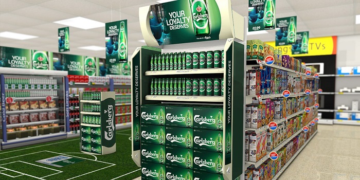
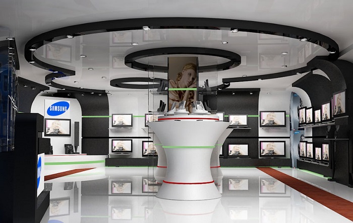
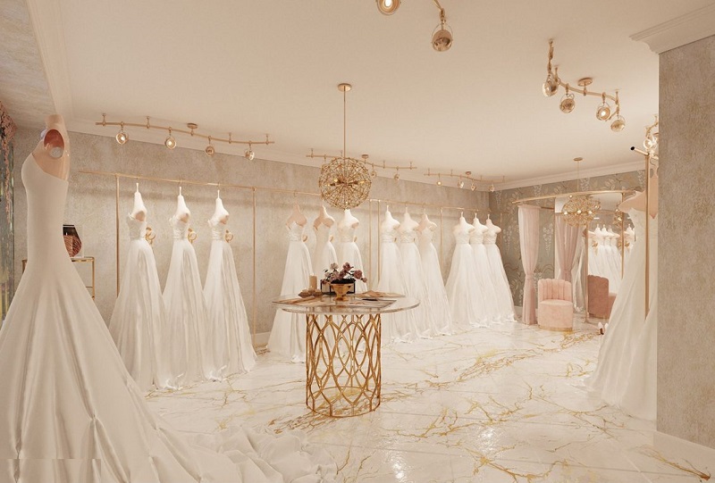
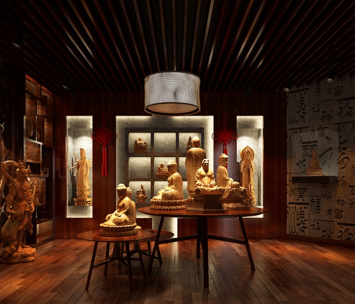
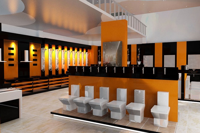
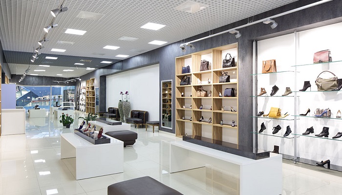
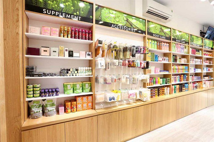
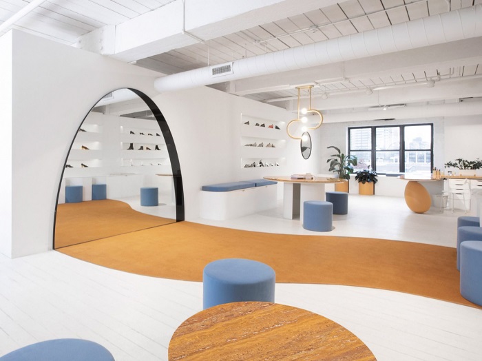
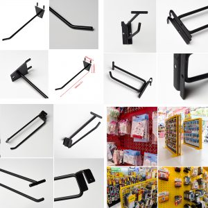
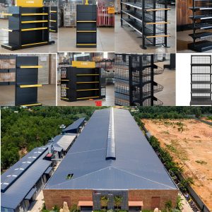
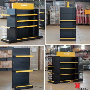
Beyond the price and product quality, what ultimately captivates customers is the design and product display. The display area can be considered the face of the store or showroom, creating the first impression for customers when they walk in. It’s a crucial element that significantly boosts a business’s revenue.
How to Display Products Beautifully
Creativity: The first factor in achieving beautiful product displays in your store is to unleash your imagination. Utilize various types of shelves to support your display effectively. Remember not to deviate from the main goal of display. Attract customers with fresh, creative, and innovative display areas.
Avoid Overcrowding and Clutter: Having fewer decorative details can often be more effective in making an impression on customers. An overly cluttered display space with too many details can make it difficult for your customers to recognize the main theme and the products you want to showcase. Therefore, design and display according to a specific theme, with decorative details revolving around that theme.
Focus on the Product: Just like in television advertising, in-store displays can easily make customers remember the display image more than the product impressions. Therefore, the product needs to be highlighted to capture customer attention. You can draw the attention of shoppers by arranging products harmoniously in the display area at different heights and depths to create an appealing overall presentation.
Utilize Lighting: Lighting plays a crucial role in adding intangible value to the product right at the display point. Even if your display space is just in a small corner of the store, well-lit products can easily stand out. If your display area focuses more on the image or brand rather than the product, lighting should be balanced. Typically, a combination of white and warm lighting is used for shelf displays, so it needs to be adjusted accordingly to fit.
Target Pedestrian Traffic: Many of your potential customers are outside on the street, so display in spaces such as windows or glass walls, making them larger and more colorful. For the fashion industry, using mannequins and striking poses to impress pedestrians is also a great option.
Design Principles
The purpose of showroom design is to create a synergistic space, providing a convenient place for customers to view products, showcasing the entire design elements of the product, and, at the highest level, emphasizing the company’s brand identity. This also involves the art of beautiful product display. Therefore, it is necessary to consider the following design principles for showroom design:
Focus on Product Characteristics
Characteristics are the most important feature, which is also why the showroom is always the place to display the best, highest-quality samples of the company. To help customers grasp the quality and models that the company can provide, the products need to be displayed accurately.
Shelf displays are the ideal space to highlight the outstanding features of the product, thus optimizing the company’s brand and making your product stand out the most. Shelves need to emphasize both centerpiece products and satellite products. From satellite products, you can assess the main focal point of the company’s products.
Lighting is crucial for showrooms and stores
Lighting and its intensity can make your products shine, especially when used in jewelry showrooms, cosmetics, bridal shops, and more. On the other hand, white lighting can make the showroom appear more upscale and elegant.
The purpose of lighting is to capture the attention of anyone entering the showroom; however, you should avoid being overly ambitious and overusing it. Be mindful of the visual stimulation threshold, keeping it at a level that is safe for the eyes.
Optimize the Space
Showrooms and shops come in various sizes, and larger products require more space, while smaller ones need less space. Optimizing with wall-mounted cabinets or specific shelving designs will allow customers to interact with more products without feeling overwhelmed by limited mobility.
Each product will have its own characteristics, weight, and density, so evenly distributing the load in the space cannot be generalized.
Avoid Clutter in Design
Colors can contrast with the products, but if not combined properly, they can make the space appear unorganized. Dividing the product samples into separate areas with distinct colors requires cohesion, reducing the compactness of the space. The more fragmented spaces there are, the more it disperses the customers’ focus.
Utilize Mirrors
Mirrors in a space serve the function of enlarging the space, reducing the need for excessive decoration, and providing a place for customers to view products effectively. While in the past, designing walls with various decorative elements was popular, the trend now is to use mirrors as a common and gradually replacing feature. Using mirrors in combination with lighting also enhances the overall decorative effectiveness.
Stores, showrooms, supermarkets, and more are places for displaying and introducing products, with numerous visitors and shoppers every day. Therefore, to make customers see that you have a professional store, you need to ensure that the elements are beautiful, coherent, and the displayed products are easy to find and choose, which will result in higher revenue.
If you’re a business in need of a reputable company for showroom and store design and decoration, please contact Á Đông at the hotline 0939960403 for further consultation.


